


Brand Guidelines
Our brand is a key part of the helloHOPE organization. Our goal is for people who interact with our brand to feel like they can take a deep breath and soak in truth and encouragement. We’ve put these guidelines together to help our team and our partners follow our brand standards and ensure we’re maintaining our goal of serving families well. If you have any questions, please feel free to contact us.
Sections
Logo Files and Use
Two formats of the helloHOPE logo are generally acceptable, depending on the use:
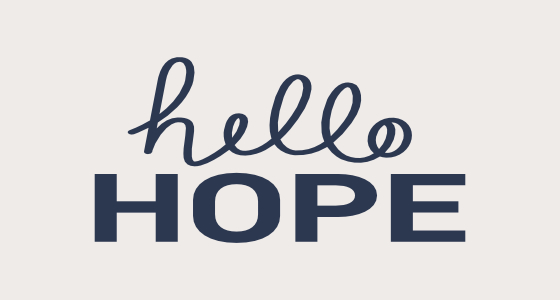
Horizontal Orientation:

Vertical Orientation:

This download includes the helloHOPE logo in various types (.ai, .jpg, .png, etc.) and color options (CMYK, RGB). Please review the “!readme.txt” file included in the packet to understand the options, use, and organization.
It is important to consider the context of the branded material prior to selecting a logo for use. Please follow these guidelines:
Do not change fonts or font sizes.
Do not change the colors used in the logo.
Maintain the original logo proportions (do not stretch the logo).
Ensure that there is appropriate contrast between the background and the logo and that background colors do not detract from the logo. If in doubt, use a solid black or white logo.
If placing the logo on a non-white background, use an image type that supports transparency (e.g. .png).
The following are examples of acceptable and unacceptable uses of the logos.
Examples of Acceptable Use


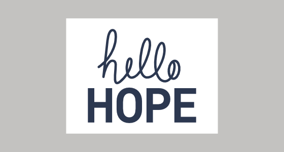
Use the navy logo on a white or very light grey background.


Use an all white logo on work with medium or very dark backgrounds.
Examples of Unacceptable Use

Do not place a color logo on a background with conflicting colors or poor contrast.

Do not add shadows or effects to any portion of the logo.
No not place the logo in a contained box that is different than the background color.
Do not stretch or distort the logo.

Do not use any versions that aren't sharp. Blurry or fuzzy logos should not be used.
Do not re-size elements of the logo.

Only a single color should be used for the logo. Do not use multiple colors in the logo.

Approved brand colors are the only acceptable colors for the single-color logos. Do not use other colors.
Brand Colors
Navy
RBG: (44, 55, 80)
HEX: #2C3750
CMYK: 85 / 75 / 44 / 39
Light Blue
RBG: (172, 197, 202)
HEX: #ACC5CA
CMYK: 32 / 13 / 17 / 0
Green
RBG: (208, 201, 112)
HEX: #D0C970
CMYK: 20 / 13 / 70 / 0
Copper
RBG: (194, 131, 113)
HEX: #C28371
CMYK: 22 / 54 / 54 / 2
Warm Grey
RBG: (221, 216, 208)
HEX: #DDD8D0
CMYK: 12 / 12 / 16 / 0
Light Warm Grey
RBG: (238, 235, 232)
HEX: #EEEBE8
CMYK: 5 / 5 / 7 / 0
Olive Green
RBG: (116, 111, 65)
HEX: #746F41
CMYK: 51 / 44 / 83 / 22
Charcoal
RBG: (82, 82, 82)
HEX: #525252
CMYK: 64 / 57 / 56 /33
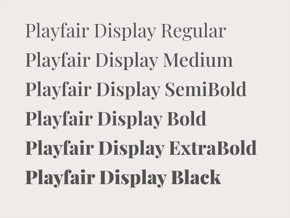
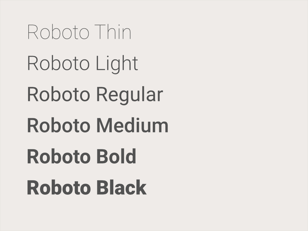
Fonts
Our organization uses two primary typefaces. Playfair Display is used primarily in headings and headlines, and Roboto is used primarily for body copy.